Primary Bath Renovation
When we bought our first home five years ago, I had no idea that it would set in motion a road map for my future. I always loved design and had watched my parents build and renovate homes through their custom home building business, but I had never spearheaded a project like this. As newlyweds, we had a tight budget and timeline. We were SO eager, that we actually put an offer on the house before I ever saw it in person.
Built in 1954, the home is roughly 1,400 sq.ft., featuring 2 bedrooms and 2 baths. Not only were the bathrooms in their original state, they were in pretty bad shape. We immediately knew both would need a gut reno. To save on labor costs, my husband and uncle did the demo themselves. In their eagerness to get sh*t done, they started demolition without taking any before pics much to my disappointment (ahem, rage). Anyway…in an effort to paint the full picture, I’ve pulled together some pictures that closely resemble the original layout. One corner featured a claustrophobic shower of death with a rotting vanity attached. On the other side of the vanity was a toilet. At 40 sq.ft., the room is tiny and hardly a primary suite. When it came to renovating this bathroom, I had two goals in mind. First, we needed to maximize space and create a more spacious and effective layout. Second, from an aesthetic perspective, I wanted to create a spa-like setting that would be transitional enough for resale value.


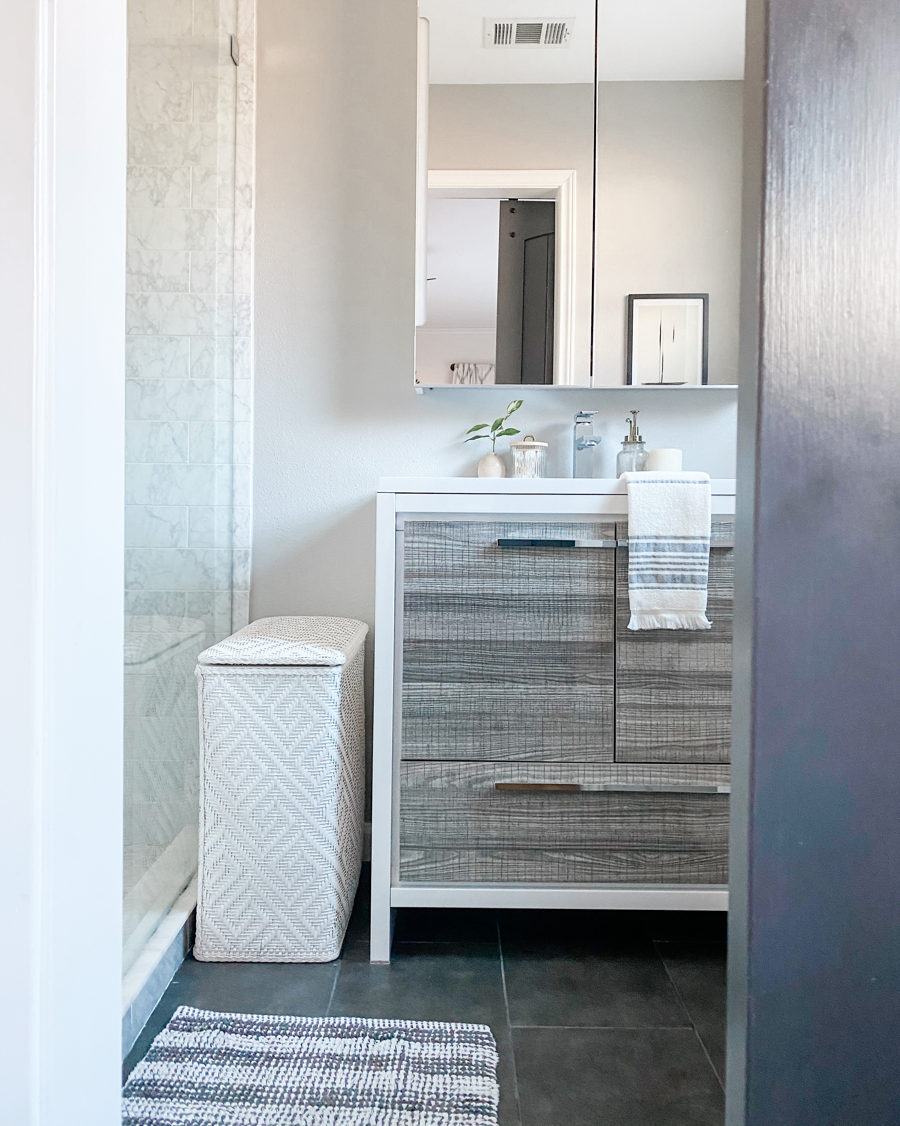
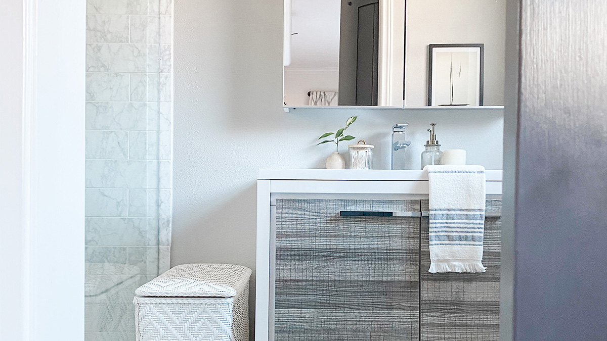
…and now the fun part! Okay, so I’m still getting the hang of this photography thing but hopefully you get a sense of how transformative this reno was…
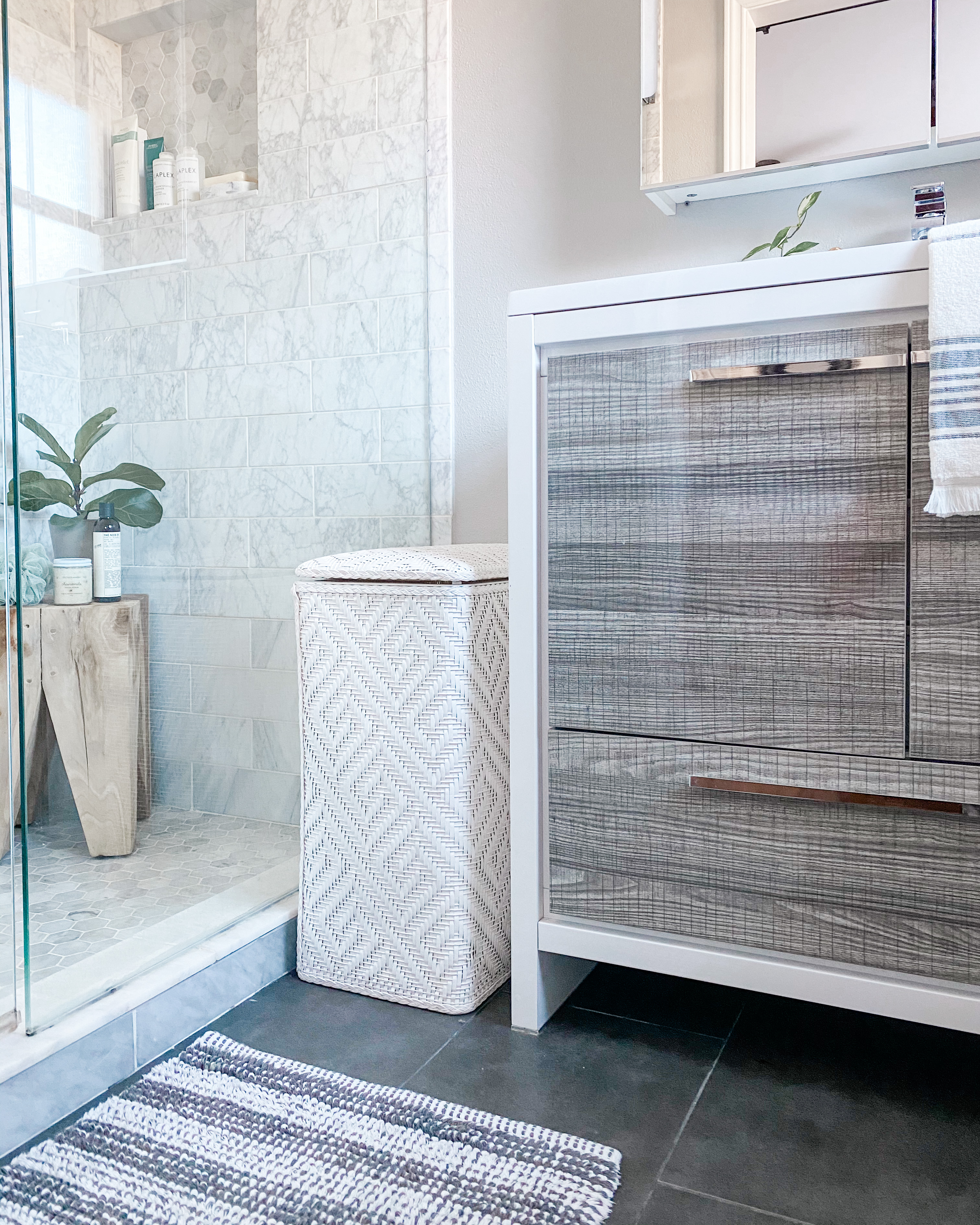
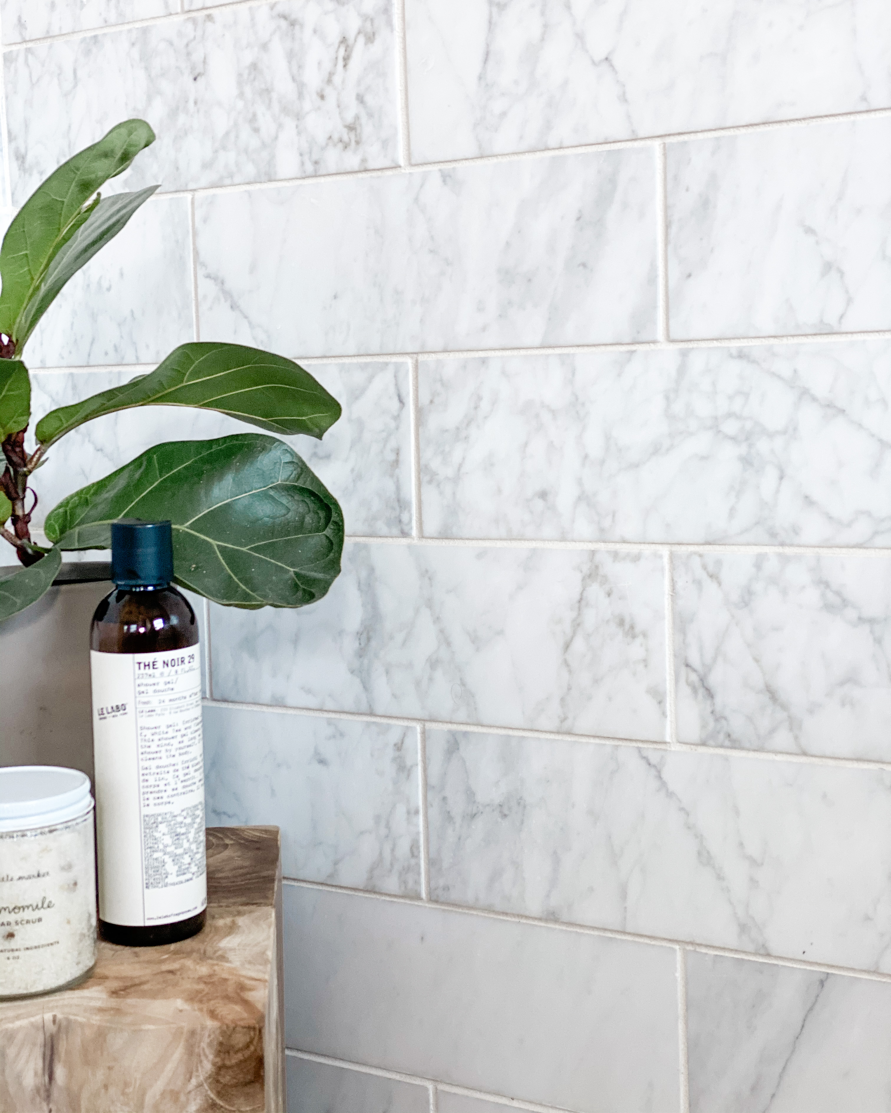
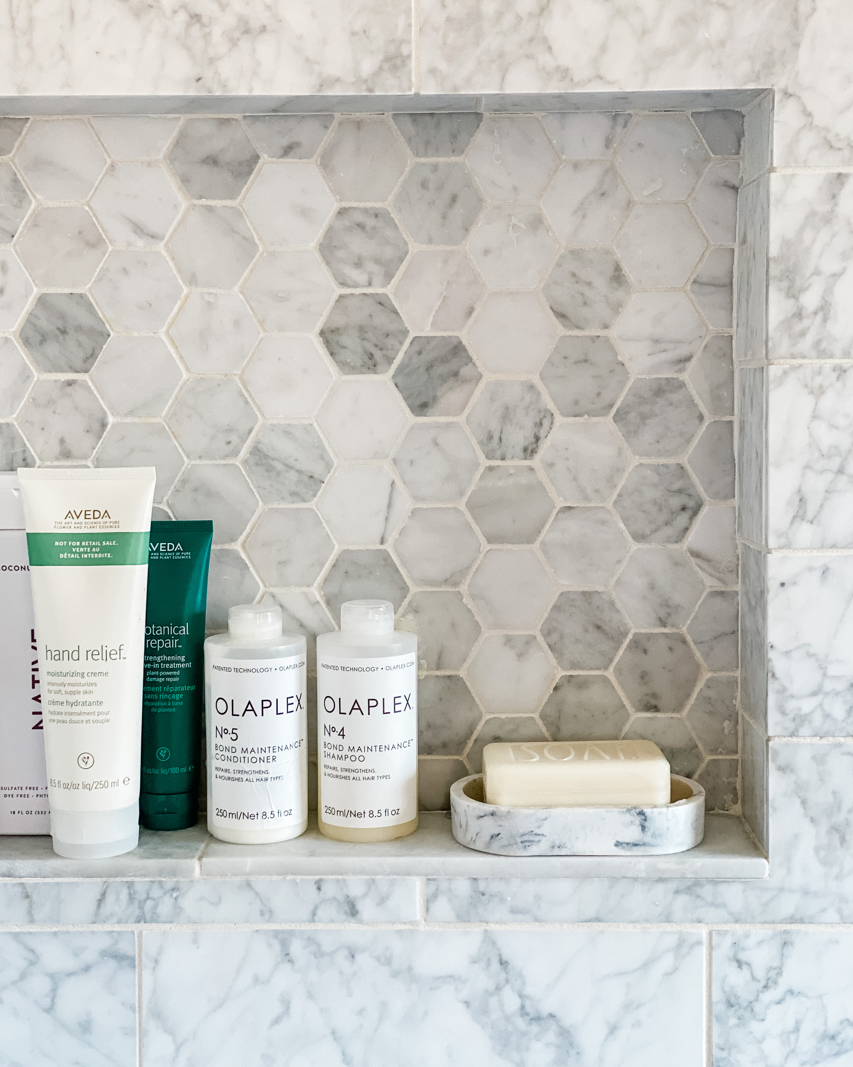
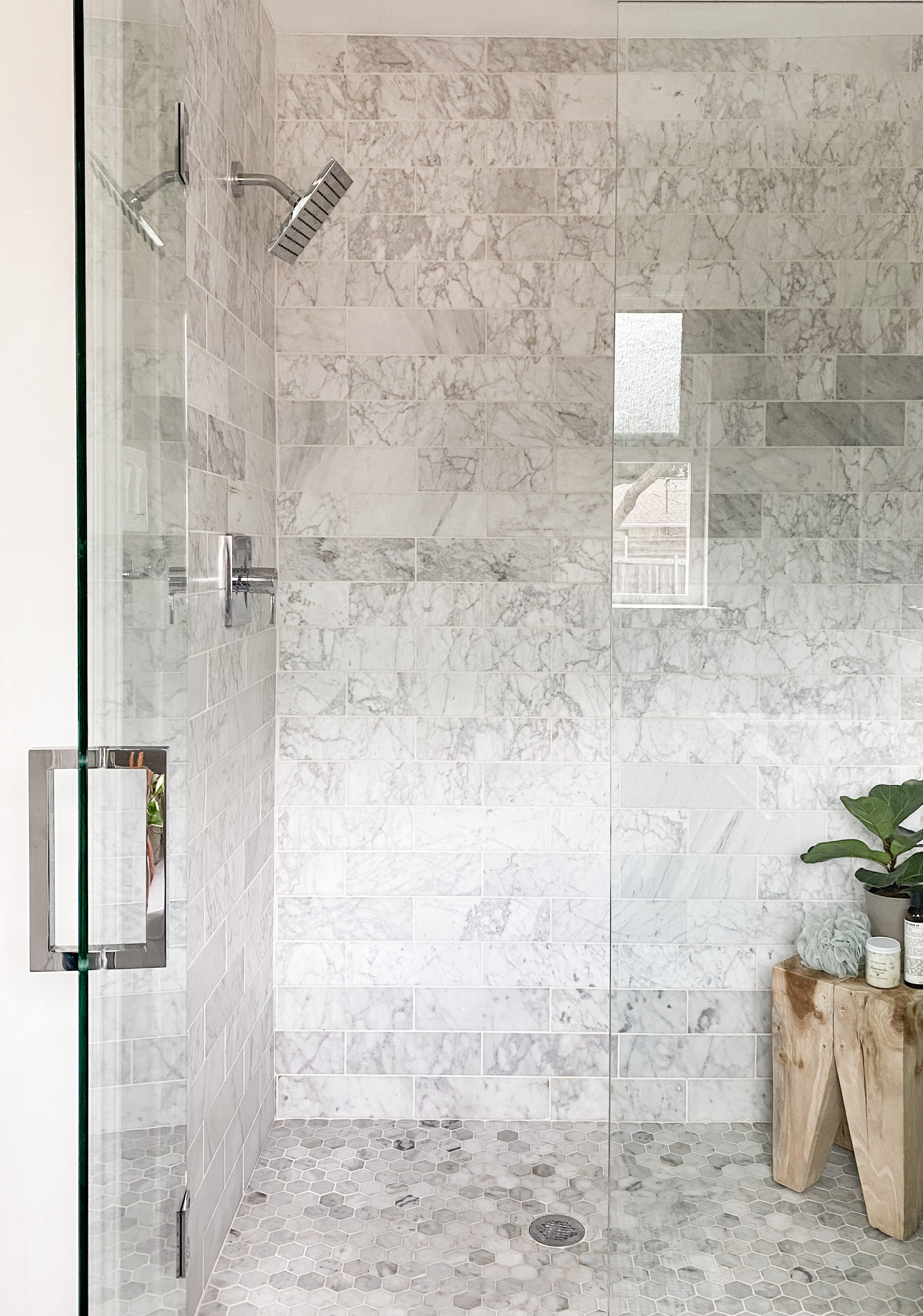
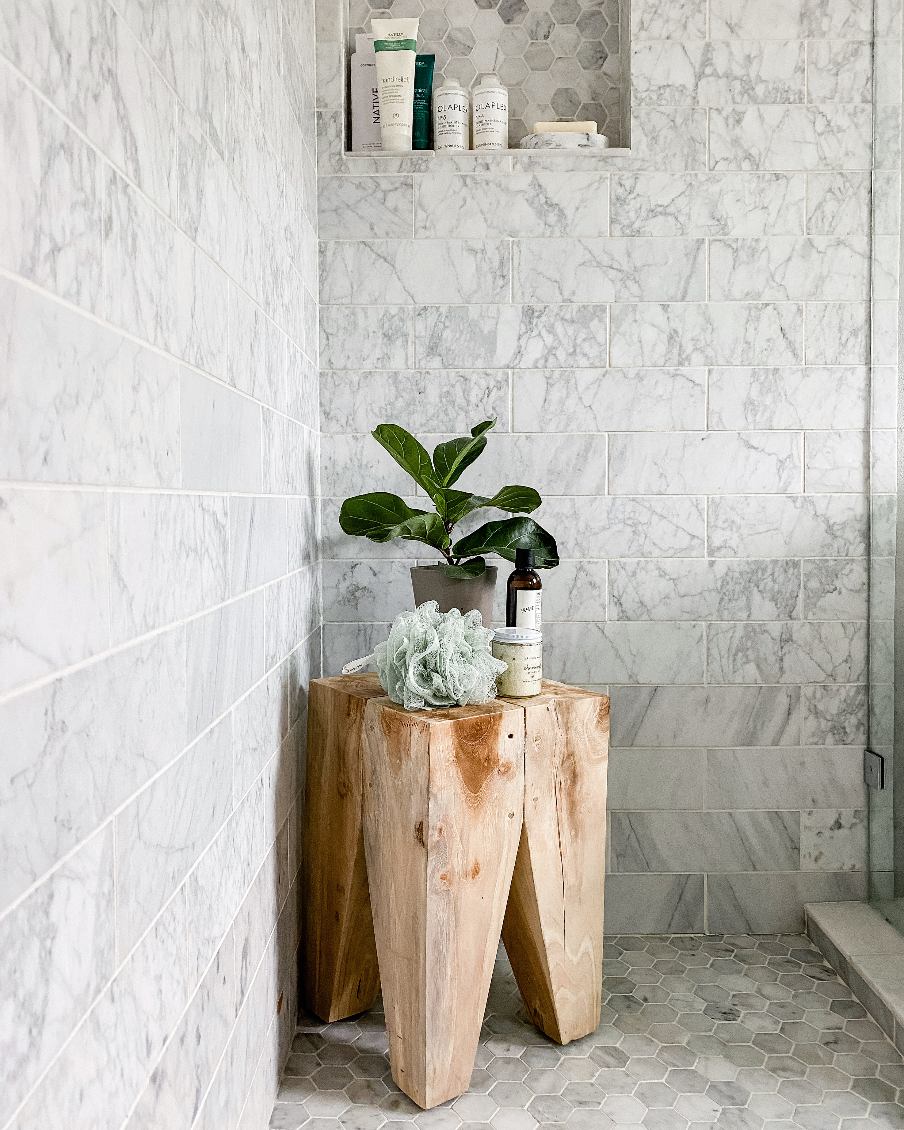
After tearing out that dreadful corner shower, we decided to reposition the shower to span the entire depth of the room. In doing so , we created a stunning walk-in shower that is spacious enough for two. Design wise, I went for a sleek honed Carrara marble as the centerpiece. By using one oversized tile selection on the walls, I created the illusion of more space. For the shower floor, I chose a hexagon mosaic tile for better grip. Also Carrara marble, the floor tile mirrors the wall, creating a cohesive look. Chrome fixtures and hardware complement the cool tones in the marble and are totally timeless.
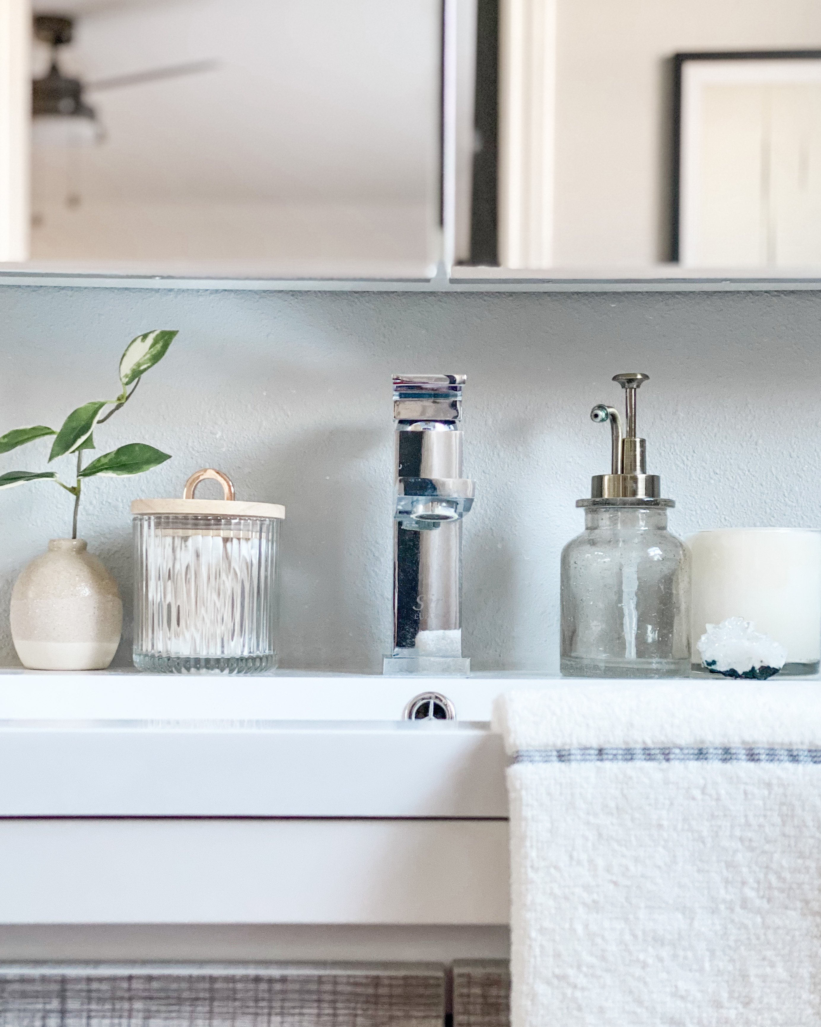
In order to fit a larger vanity, we moved the toilet to the opposite wall. I chose a more contemporary vanity from Houzz with plenty of storage space. Because I spent more on the marble shower, we had to be economical about our other choices. Instead of a standard wall mirror, we selected a mirrored medicine cabinet from Ikea that adds additional storage.
Another space hack was adding an oversized barn door in Cyberspace by Sherwin Williams. In doing so, we gave the bathroom a grander entrance that gives it that spa-like feel I was going for. After living in this space for nearly five years, I can genuinely say it’s so functional. While it’s still on the small side, it definitely feels like a retreat after a long day (unless my two year old has dumped all the vanity contents on the floor). Feel free to drop a comment or question below!
