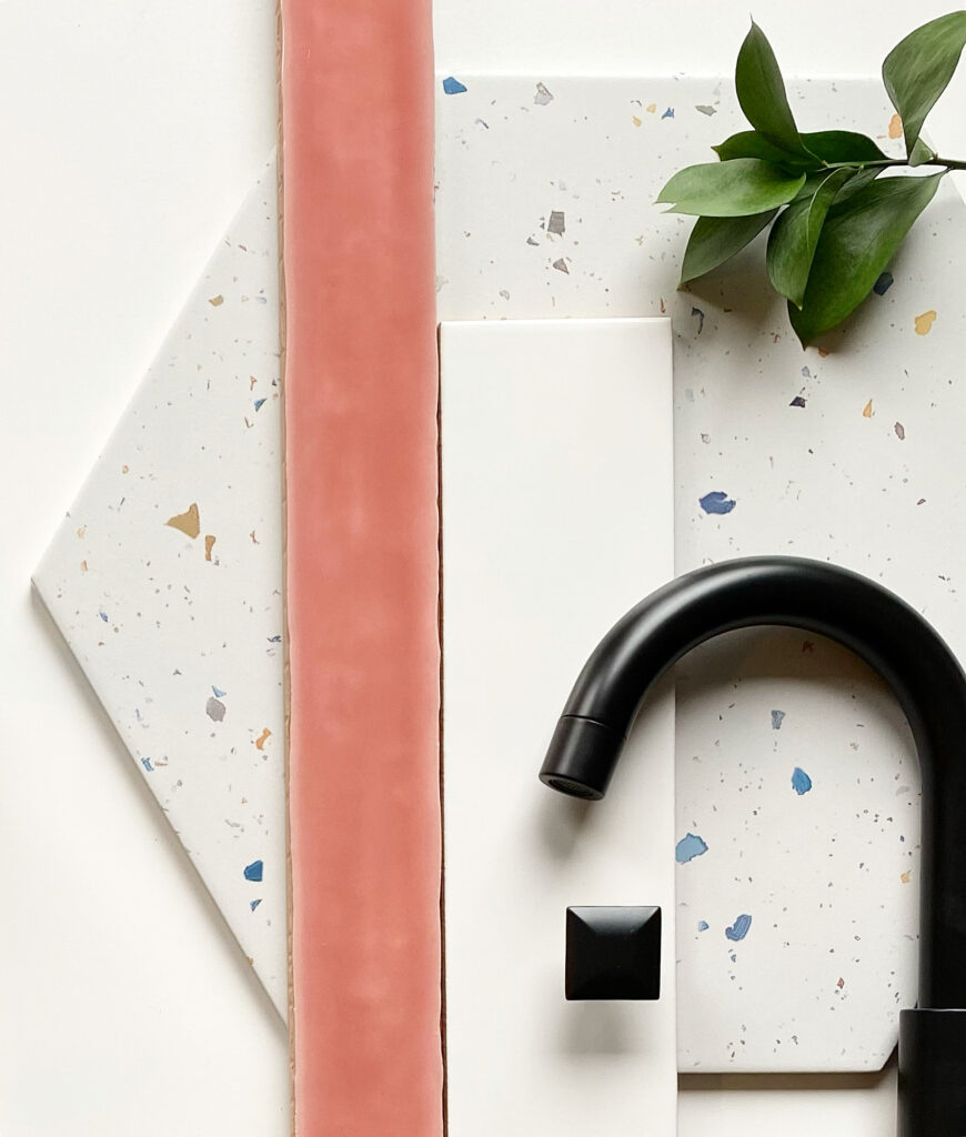
When tackling a renovation or new construction project, many of my clients have the same question: how can I make it all cohesive? I hear it often…”I have so many ideas and love so many styles but I have no idea how to make it all work together.” This is where I come in! While interiors can change over time, hard materials like tile, cabinetry and fixtures have more permanence. Over the years, I’ve naturally developed a formula when it comes to designing modern yet timeless bathrooms.
Step 1: Choose a bold tile to serve as a focal point. Find one tile that you absolutely love and build your design around that. Maybe it’s a bright color, unique pattern or intriguing shape. Many times, this is my “splurge” moment.
Step 2: Layer complementary tiles into the bathroom design. For shower tile, you can never go wrong with a classic subway tile. They come in so many variations and colors, making it easy to match your style. For this spec house, I wanted to reimagine the “pink bathroom”. I knew that potential buyers might find it too polarizing so I settled on one focal wall in this beautiful painted coral and kept the shower sides simple. I purposely chose an elongated subway style to complement the shape of the pink tile. For the floor tile, I chose a terrazzo inspired hexagon tile with painted flecks that highlighted the pink wall tile.
Step 3: Coordinate your cabinetry and fixtures. Aside from the primary bath and powder room, I like to coordinate vanities and fixtures to keep things cohesive. Choose a cabinetry style and stick with it. For this home, I did a simple, modern shaker style painted in Crushed Ice by Sherwin Williams. Matching mirrors, countertops, faucets and hardware created a visual “through” line. For these kids bathrooms, I even added matching light fixtures in different colors to complement the tile color. Fun and playful!
Step 4: Mix it up! Is it okay to choose several bold choices? Absolutely! I have always loved this painted teal tile—I even used it in a dry bar before. Because this en suite didn’t have any natural light, I knew the blue would be too dark encasing the whole shower. Again, I opted for a focal wall to anchor the space. Since the home was designed as a contemporary farmhouse, I chose a vintage inspired black and white patterned tile for the flooring. As you can see, I switched up the lighting, hardware and mirror to distinguish it from the kids bathrooms and keep things interesting yet cohesive.
While there are certainly no rules when it comes to design, I hope these tips are helpful when planning your next project. Follow along @julianarziv for more design inspo!
