Transitional Kitchen Renovation
I think my favorite thing about working in construction and renovation is that no two days are alike. Each day brings its own challenges and excitement and I consider myself a professional problem solver.
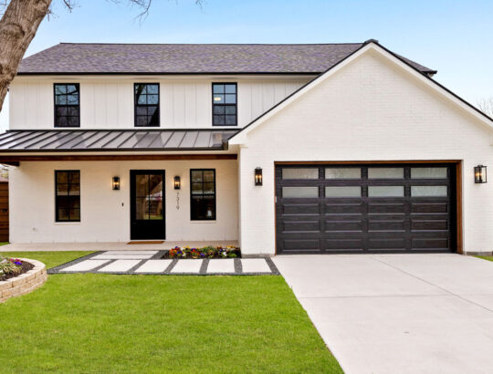
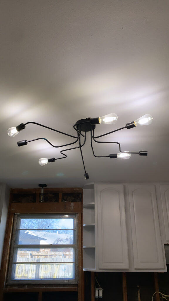
Our Sweetwater renovation project served up a unique scenario. During a crazed housing surge in Dallas, my clients were literally cruising neighborhoods for a property. When they stumbled upon Sweetwater it was already being renovated by a local investment group. It’s very common to see investors doing flips on a tight budget, forgoing a designer in favor of better margins. I get it! We’re all here to make money but many of the choices they were making were straight up strange (check the lighting!). We had a proposal: the clients would buy the property ‘as is’ and complete the renovation independently…and it worked!
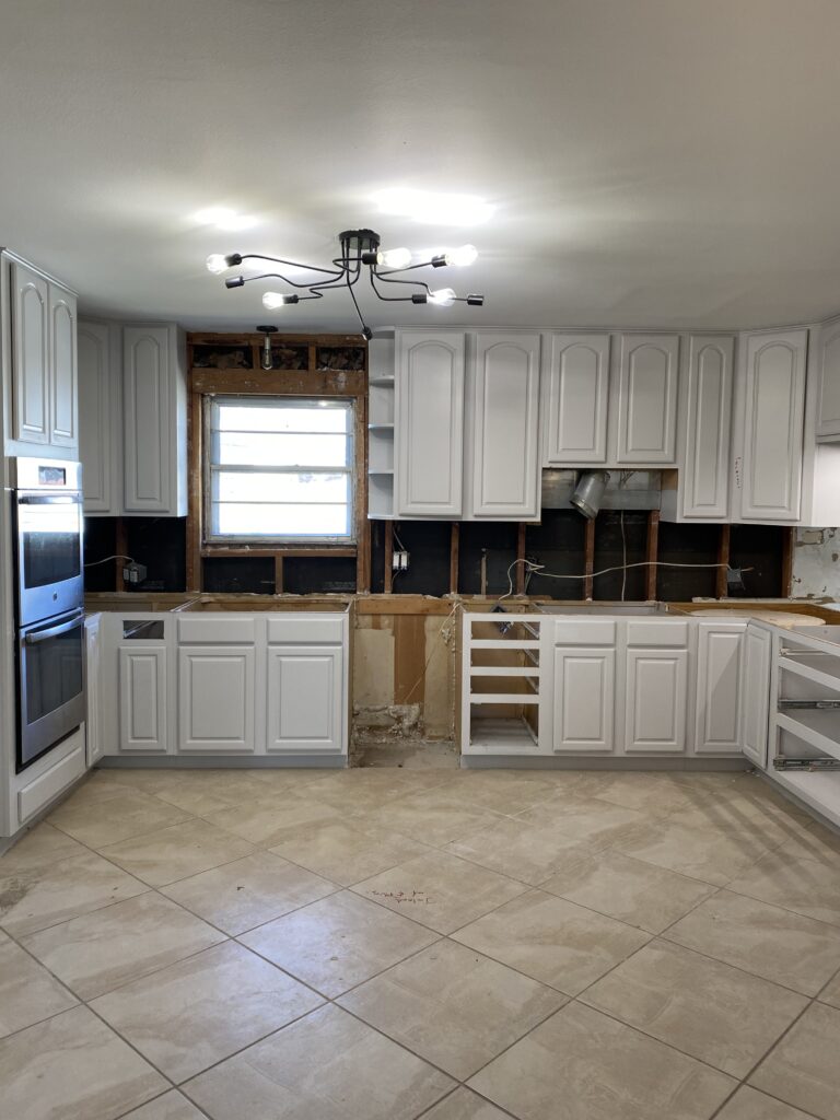
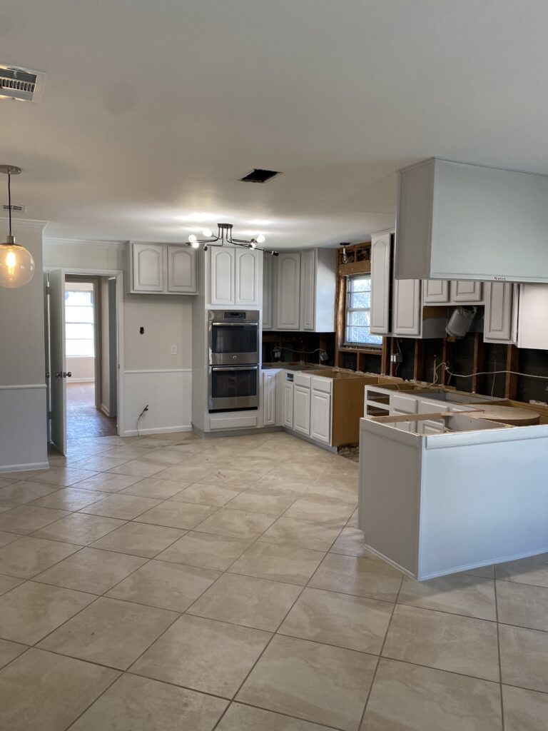
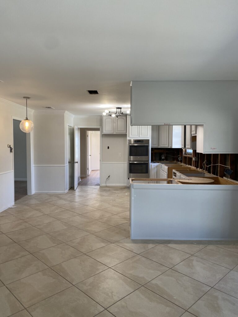
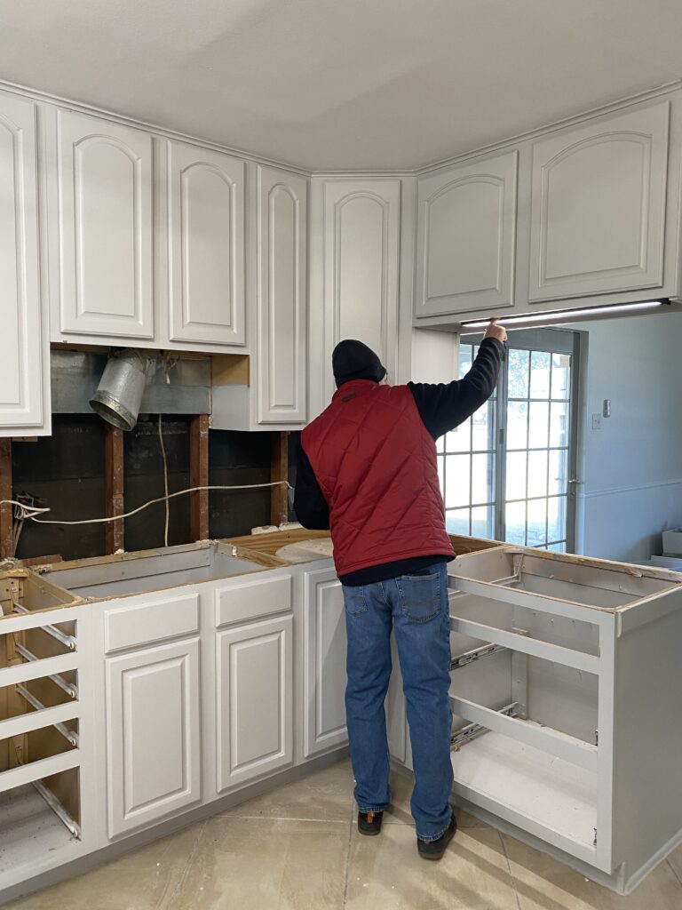
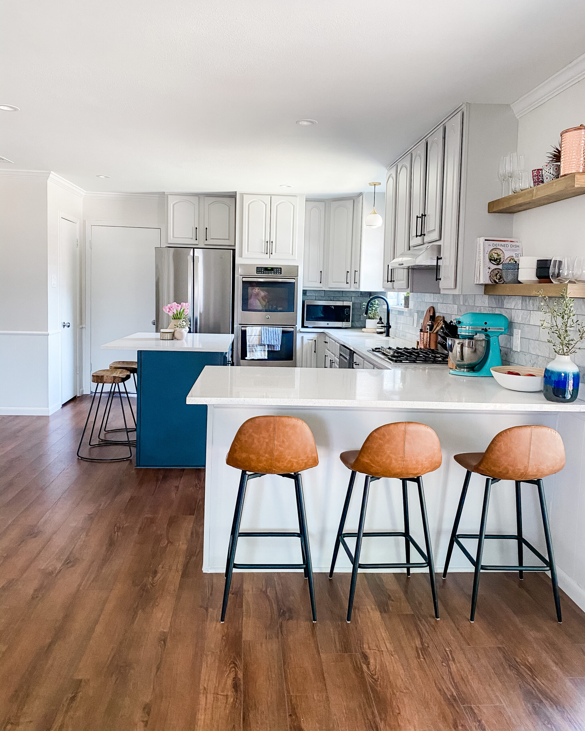
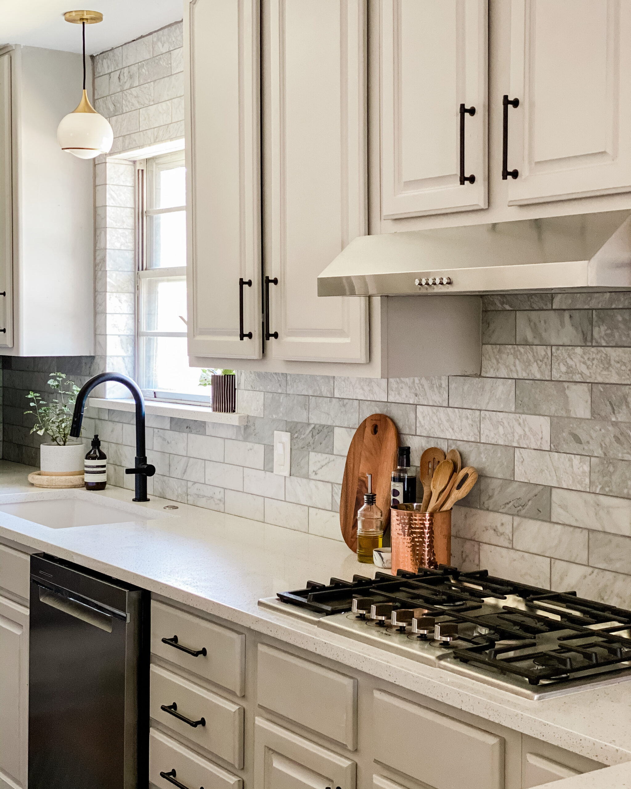
Sweetwater is a 3/2 family home in east Dallas. Most of my focus was centered on designing the kitchen and dining space. Our main goal was to create a more open, functional space connecting the kitchen and dining area. To save on costs, we decided to keep the existing kitchen cabinets. The only catch? They had just been painted by the previous renovation team. Now, I had to create my materials palette around the existing color—Chic Gray by Behr. To complement the putty gray cabinets, I added a contrasting kitchen island in Iron Ore by Sherwin Williams. It anchors the kitchen space and lends a contemporary quality to the overall aesthetic.
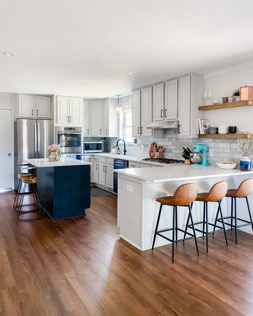
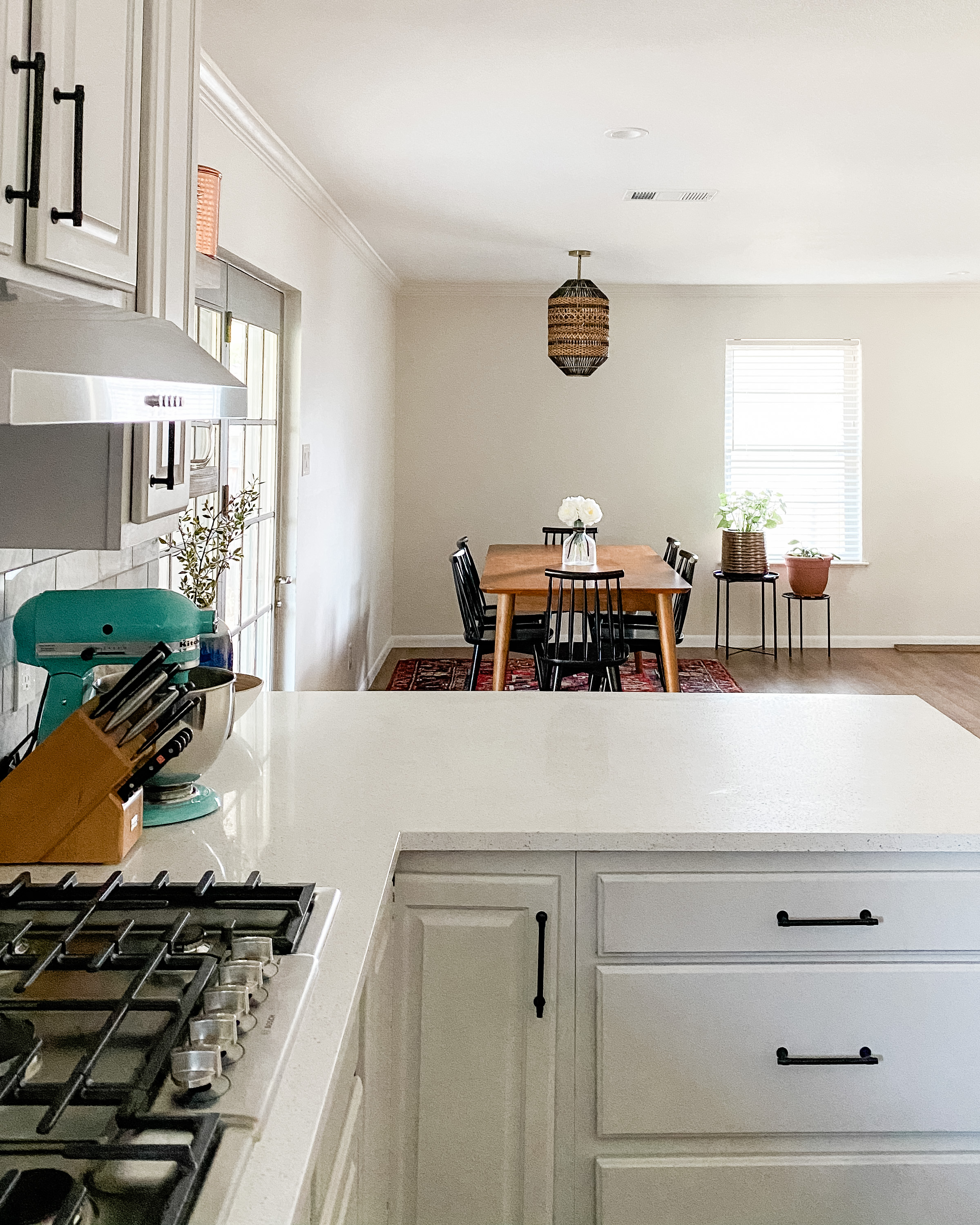
We also decided to remove the existing cabinets over the peninsula, creating a line of sight from the kitchen to the dining room. We replaced the cabinets with open shelving to showcase decorative glassware, ceramics, and cookbooks. Adding an overhang to the new quartz countertop made the peninsula functional, adding extra seating for three.

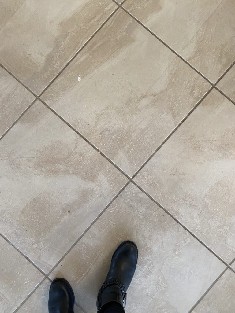
Initially, the client didn’t want to replace the flooring. While the existing tile was certainly functional it just didn’t work with our scheme. Instead of matching hardwoods to the rest of the house (which can be quite costly), I proposed luxury vinyl planks. Vinyl has come a long way and is surprisingly durable at a great price point. The finished effect makes a huge difference in the transformation.

Working with JRZ was an amazing experience. Juliana took the time to understand how we wanted to use our space, our personal style, and our budget to design a home that we love. She also coordinated with us virtually in the months prior to our move to keep our original timeline. She is a perfect blend of vision and professionalism, and we would highly recommend her services.
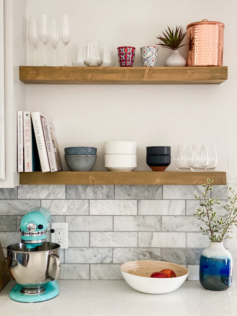
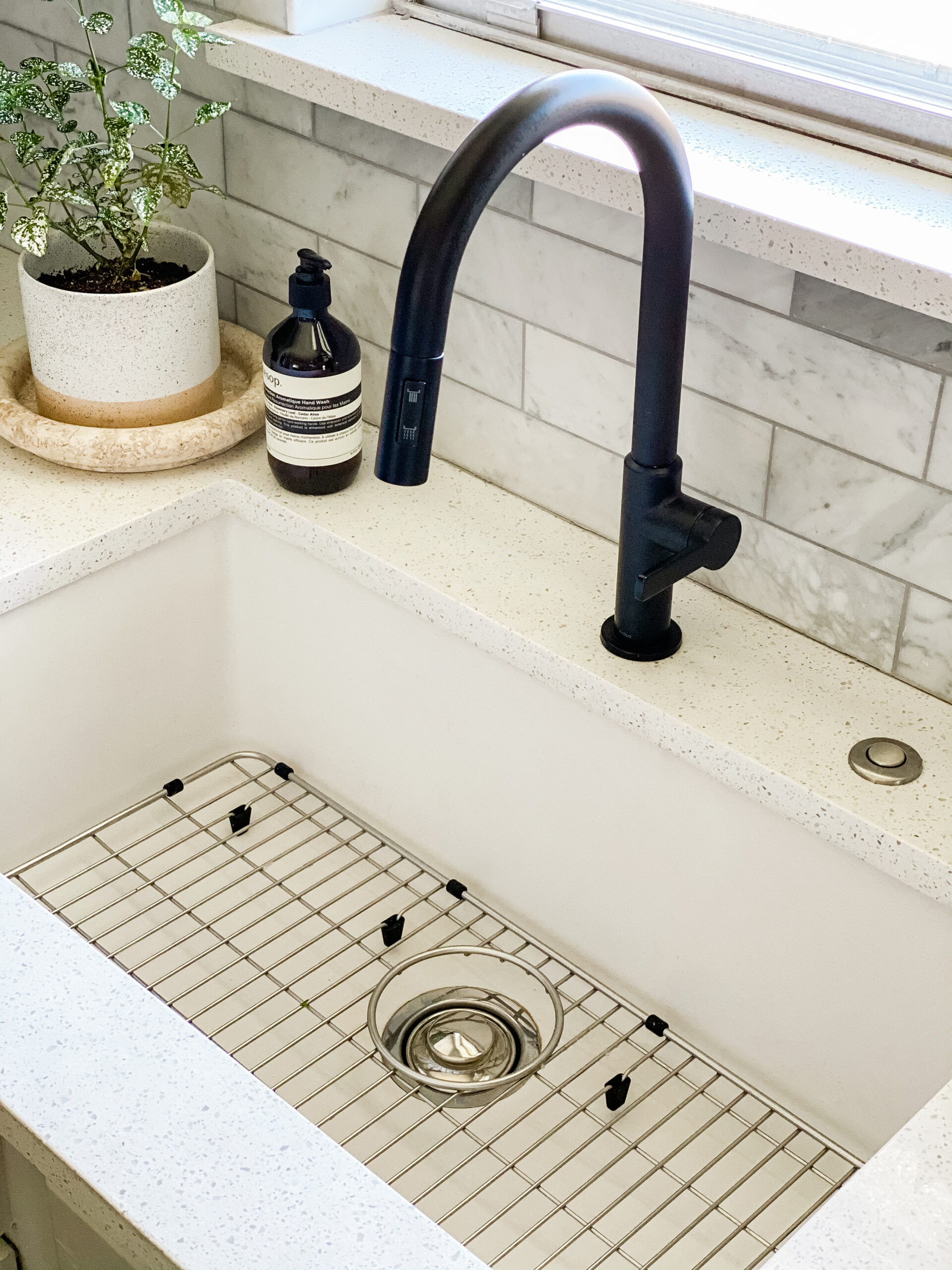
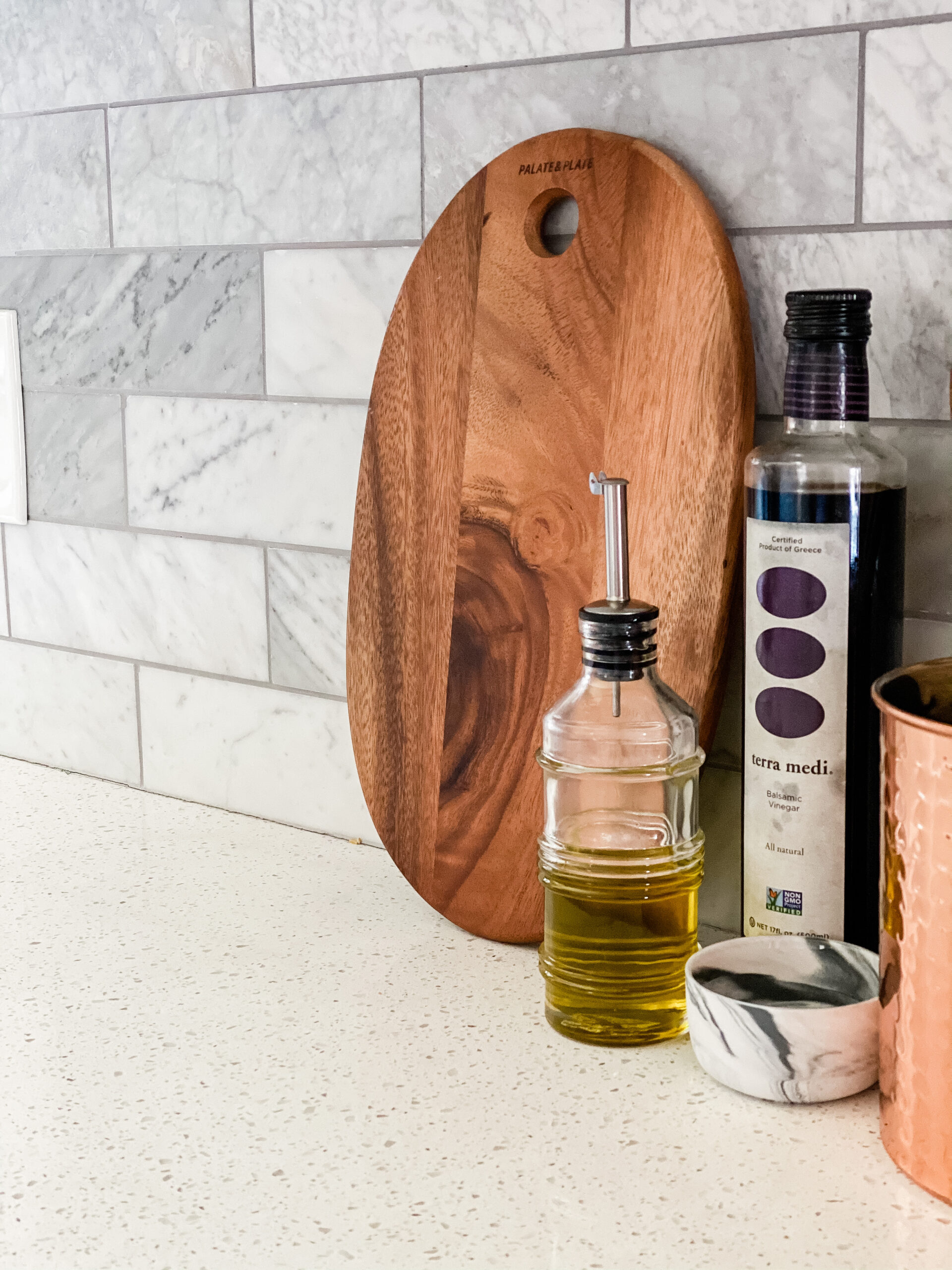
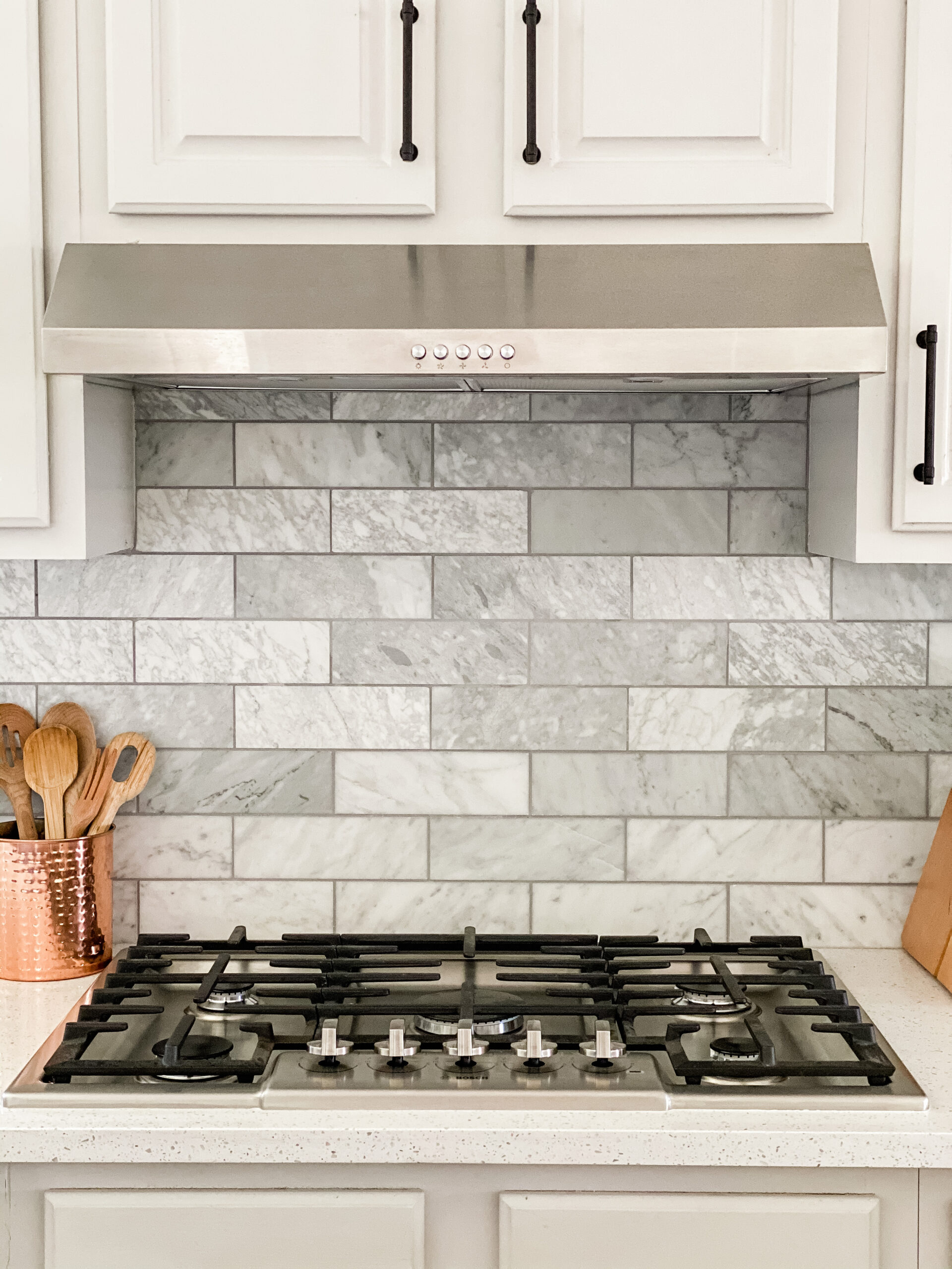
For the kitchen backsplash, we went with a striking Carrara marble tile. Instead of a traditional white grout, I opted for a medium gray tone to soften things up. A new fireclay sink is a subtle nod to the farmhouse trend while a modern black kitchen faucet is decidedly contemporary. You know I love the balance. A simple and sophisticated teardrop pendant in antique brass and black frames the sink area, offering a moment of pretty. New stainless steel kitchen appliances and matte black hardware made things feel nice and fresh. Finally, we added new lighting to the adjacent room, framing the space as a formal dining room. I held onto this pendant from my Arteriors days and I’m so glad I did. Hand-woven, each detail is crafted to perfection to reveal a modern organic pendant that is the ultimate conversation starter.
I couldn’t be happier with this stunning kitchen transformation. Whether you need guidance on an existing renovation in Dallas or full-service interior design and renovation, drop me a line for a complimentary consultation. I also provide consulting services for clients all over! I’ve worked on projects across Texas, Maine, Missouri and Virginia to name a few.
Follow along @julianarziv for more inspired design content.

